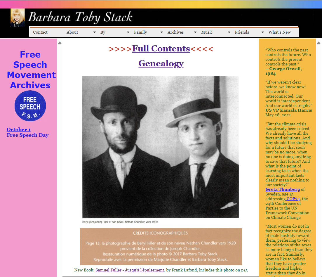
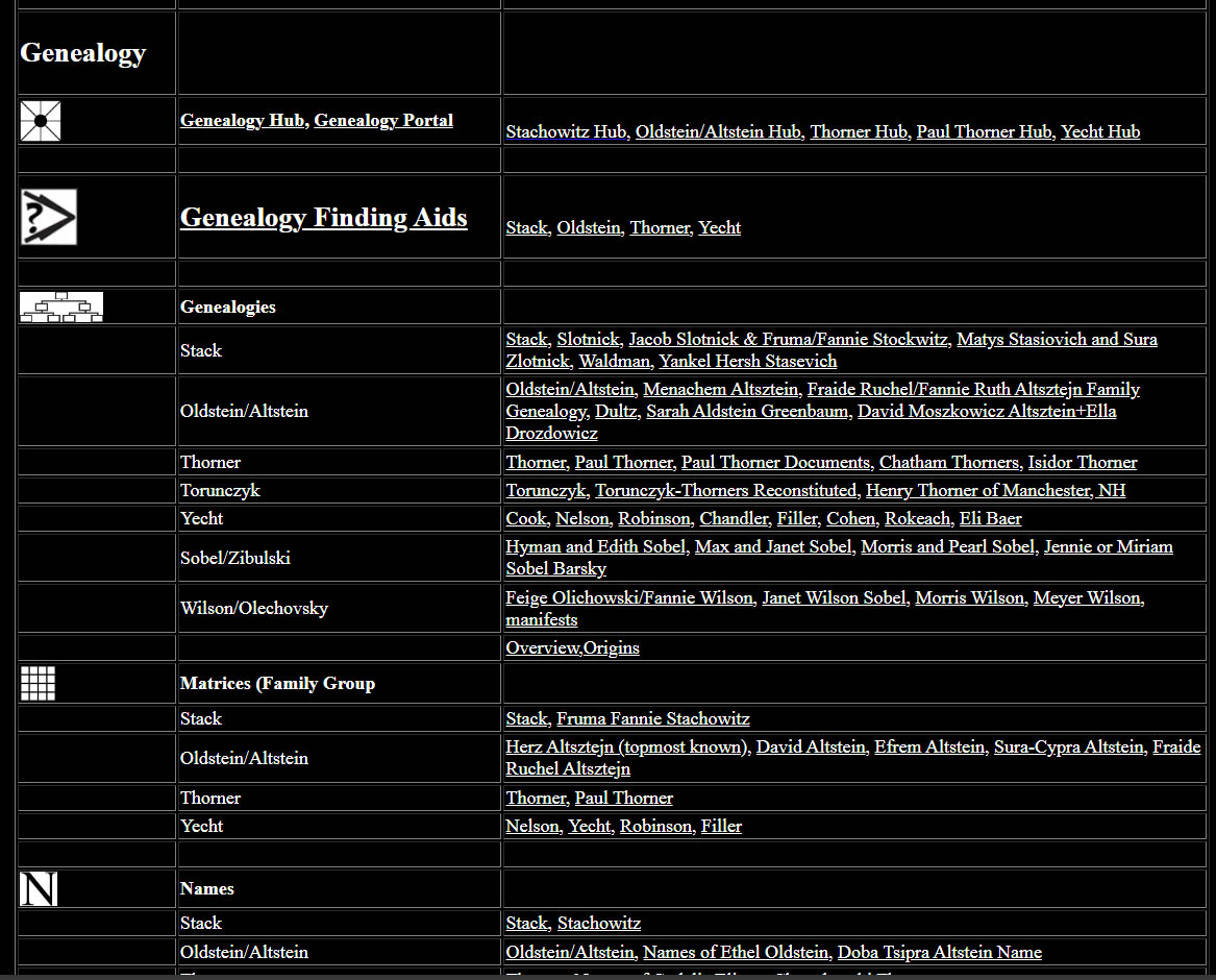
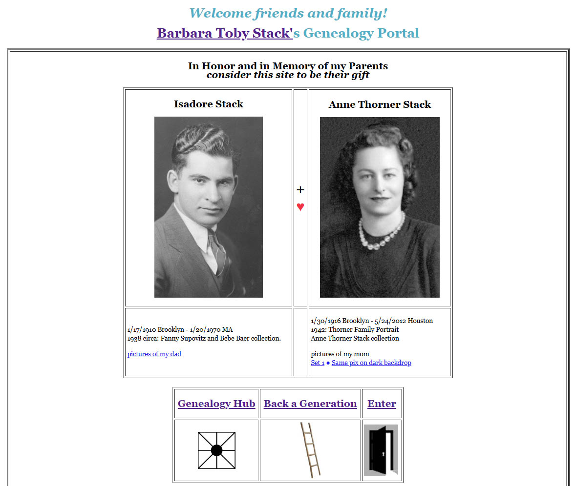
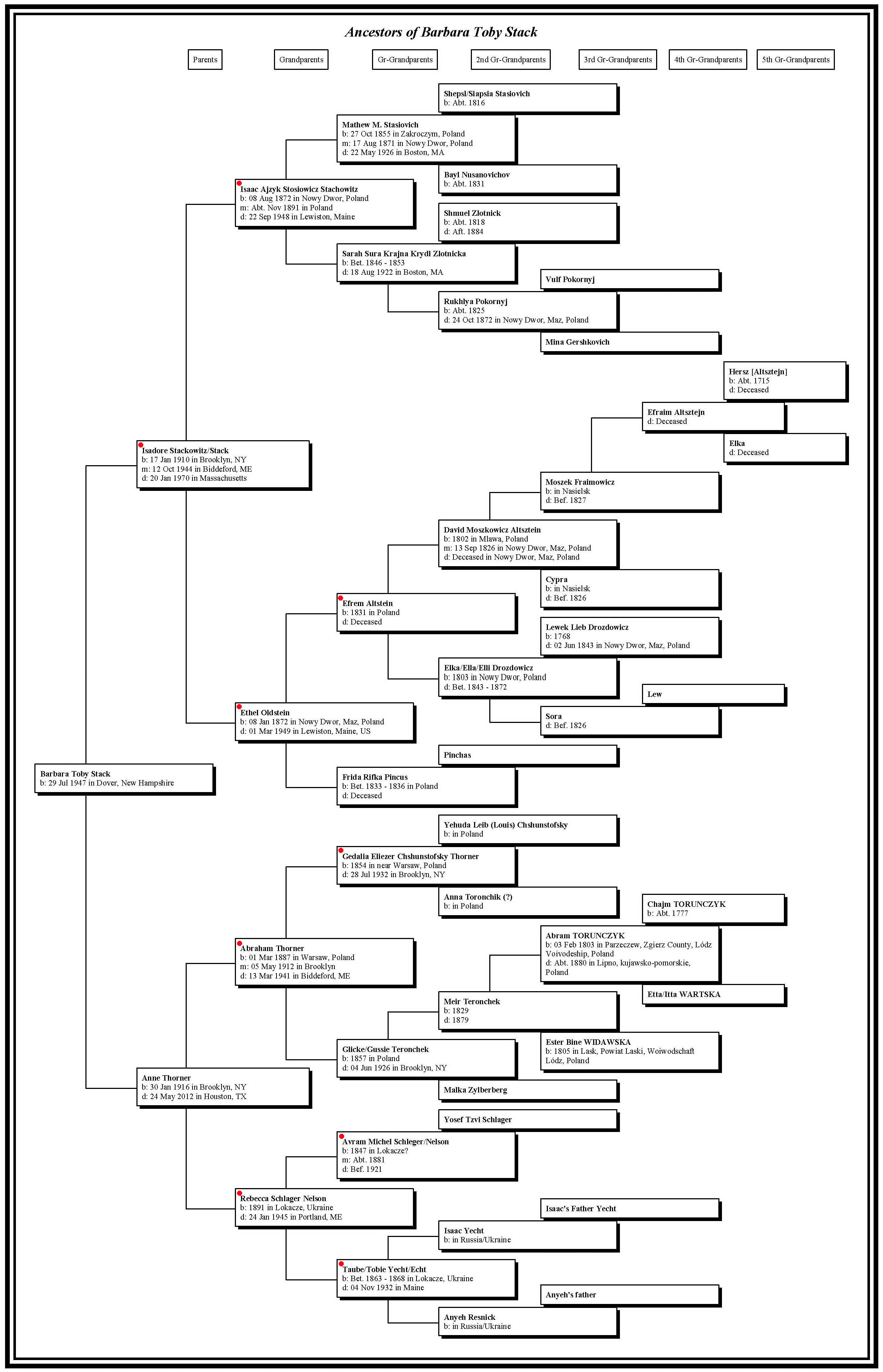
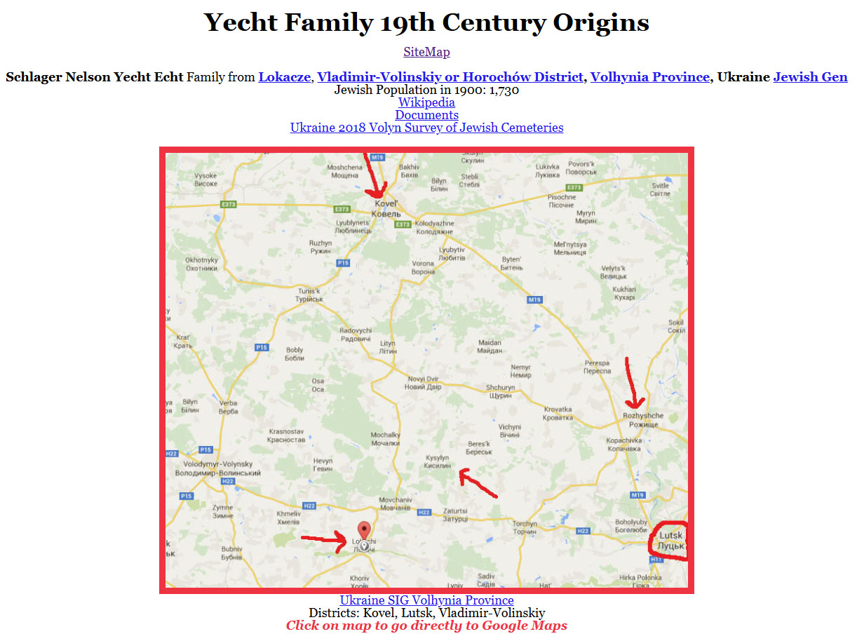
November 17, 2024 In 2010 I decided to make a website, primarily to organize and share my genealogy research. In 2018 I reported to SFBAJGS members on design issues. As SFBAJGS Board member Janice Sellers told me, “A website is a cousin-catcher.” It’s also a catcher of non-cousins. “I would love to know how we are related,” one wrote. "We aren’t," I replied. "My sister is married to your cousin." Some of my pages concern friends of my grandparents and marry-ins. In order to address the various viewer points of view as I became aware of them, I continued to elaborate the ways of entering the site, of arranging the contents, and of searching it. The site became more and more complex. The other important point of view is my own: the site needed to make sense to me as a format for organizing the mountains of materials I was finding and assembling. And the site gives me access to thse materials when I am away from my computer. At one point I remembered a Victorian home in southern Maine my family would pass on our way up to visit cousins. As a child I was taken with a vision that we might one day all move in together. When Issie discovered that photo on my site, my response on the fittingness of the image: “No. too many back staircases.” It has, perhaps, come to resemble more the Winchester Mystery House. I have come to accept that the experience for some viewers might be more like wandering around a vast digital game universe. I really enjoyed the old Hypercard game The Manhole. There are many pathways on many site provided by internal links. There are some insights I can offer to wanderers in the digital world. You might just google a person or topic of interest and be pointed to a specific page on my site. Or you arrive at my home page. You see a row of links at the top, which are remnants of an old navigation system. If you click “Family” it takes you to the same place as if you had clicked “Genealogy” below. “Full Contents” takes you to the same Site Map page. I use the Site Map as my main navigation space. Sometimes I use control+F (On Mac: command+F) to find something.
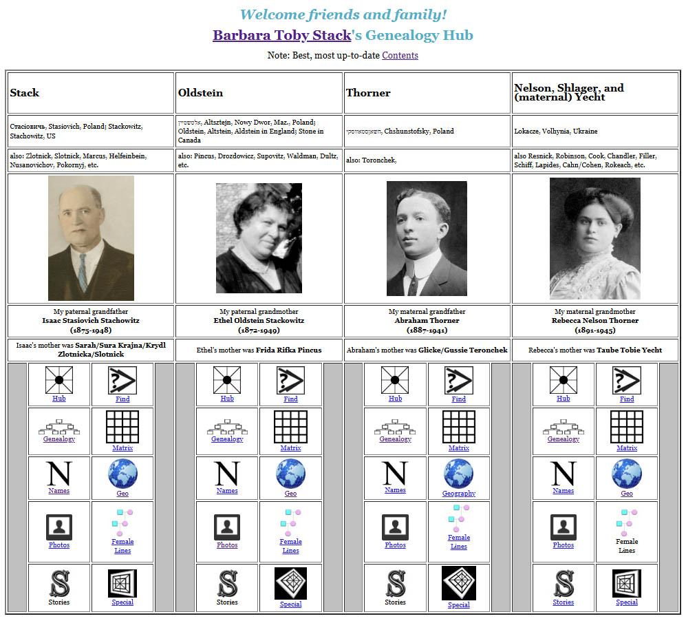
You can be herded. Herding the audience with converging option—the illusion of choice. This is widely used by web designers. All the icons and the underlined words lead to the same place. Note the ladder icon. I pair it elsewhere with a slide icon. As child I plated chutes and ladders and the iconography remains as part of my symbol system. For me, back in time is up. Lets look at the icons on the Grandparents page, a set which corresponds to the icons on the SiteMap page. One question was how many should there be. 10 seemed about right. “Special” is the catch-all category, the junk drawer of my genealogy. I also visualized this panel as a handy remote control.
Should the menu for a tree look like a tree?
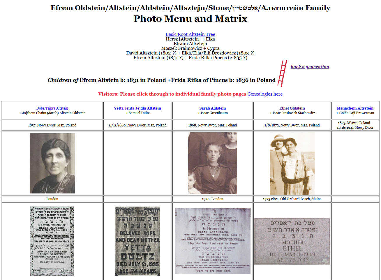
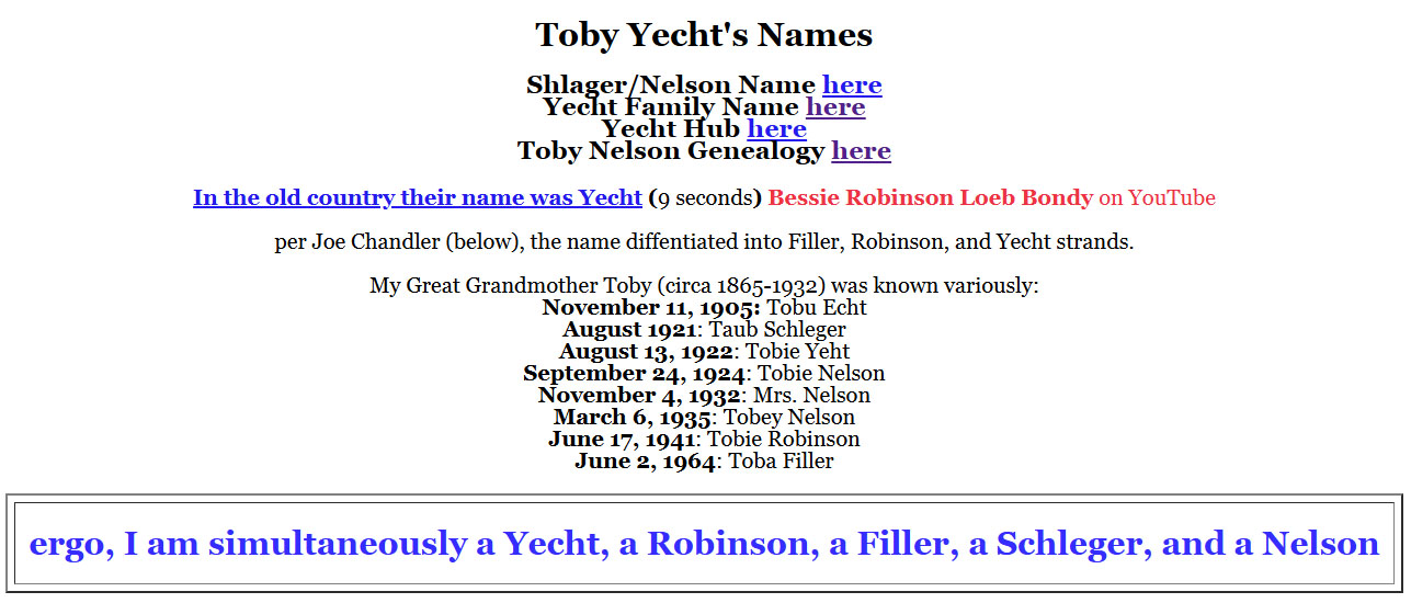
This category has changed over time, and has included downloadable pdf summaries of research on specific families, as well as web pages devoted to similar material. Matrices or Family Group Sheets My father's mother's family, the Altsteins, Oldsteins, and Stones and my Aunt Fanny's Address book. Toby Yecht's Names
Albums, resolution and restoration, watermarks Family relationships fall apart over time and information decays. Female Lines Stories and Narratives Novel perspectives & slices, Family Gatherings, Diagonals, Cross-sections, subsets & supersets There is no center for Documents, which are scattered throughout, though mostly in Genealogies. One collection gets its own page: Paul Thorner's father's collection From left field: Russian Teenager makes contact Torunczyk-Thorners Reconstituted Preservation and future access: I was once determined to claim copyright. I came to understand that what I really most wanted was for people to download and save the information. I will be forgotten and that’s ok. My family has promised to preserve the site, but as that happens only at a cost, modest as it is, about $100 per year, that’s not likely to go on forever. It can also be both saved and accessed as a collection of files on a memory device. My Favorite recent pages |

